One Layout To Rule Them All
Monday, 30th July 2012, 16:03
Tablets are clearly going to be a major proportion of web browsing in the near future, 40"+ HD resolution TVs are becoming common place, and desktop monitors continue to get bigger and bigger. The standard approach to web design used by nearly every site, is to use a fixed width.
But really it's a bit of a cop out, you choose a tiny range of widths that your site can resize to, design everything around that and centre it. Back when DVD Reviewer was new, things were different, it had a liquid layout which had to deal with a minimum screen size of 640x480, but worked nicely up to 1280x1024. Not many people had a monitor any higher than that, but over the years times changed and forcing a maximum width was the only real solution to a layout that becomes too stretched.
Now recently, I've begun porting the MyReviewer.com website to Node.js, and in the process of such a complete rewrite it makes sense to take stock of what is worth changing. Obviously the back end goes async, new ways of doing things come in to optimise performance, but the front end deserved a good redo as well.
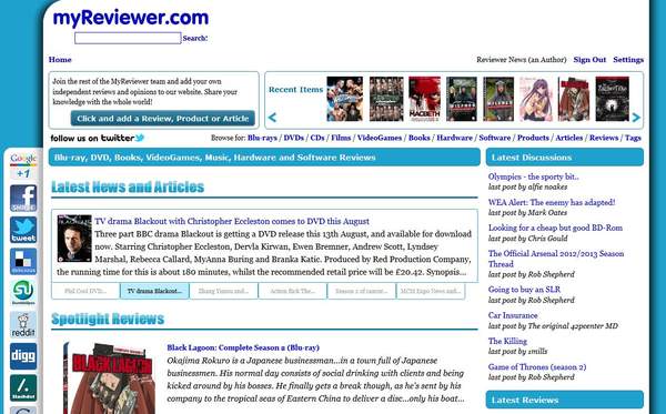
A quick look at how things appear at the moment, so you have an idea of what we have to work with:
Since essentially each page is a content area and a lot of surrounding context areas, I quickly came to the conclusion that there was an opportunity here to do something different. Have one dynamic layout that tries to use all available space, that looks nice on a tablet whether it be in portrait or landscape mode, and still fills a modern desktop PC 1920x1080 screen comfortably.
And for good measure, let's throw away the idea of scroll bars.
Breaking Things Down
This sort of thing cannot be done without client side Javascript, so custom jQuery plugins are the order of the day. The nature of this sort of website makes multiple columns the answer here. What we'll do is have a fixed header, with a fixed menu at the foot of it, then a main content area which contains a single vertical column on the left, and the rest of the space given over to the article itself.
Then, we'll use our custom plugin to look at the space available, creating more columns to the right of the article so the width of the article area is no more than a certain reasonable amount, moving across pieces from the left column as required. To help it out we'll add pointers via HTML attributes server side, which will let the client side know for any given number of columns, what should go in each of them.
Because we are dumping scrollbars, we'll be using collapsing/expanding blinds, which allows us to cram more information onto the screen without it being too cramped. We'll also give hints as to the starting heights of the blind areas, as some are more important than others.
On the subject of blinds, we'll need another jQuery plugin to handle those, and both this and our main layout plugin will need to offer a huge range of options for scrolling because we won't have a scrollbar. These include arrow keys, page up and down, home and end, the mousewheel, actual up and down buttons, a goto button for traversing long documents, and lastly both middle mouse and touch dragging. Hopefully this will make it intuitive enough for people to barely even notice the missing scrollbar.
One thing which is right out the window, is mobile phone devices, or similar things with such a small screen. I'm not sure there is an easy way to achieve one adaptable layout for every single screen size. There comes a minimum below which it just becomes pointless and you are best off making a new way of viewing for it.
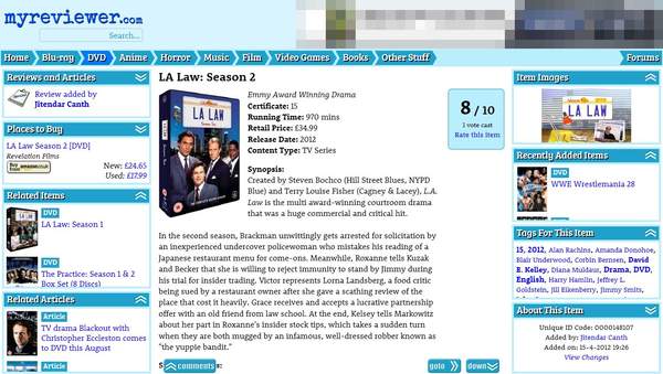
But the odd minor bug aside, things have worked out quite well. Here is the layout when the screen width is about 780 pixels wide:
Give it more space and it can expand things to three columns:
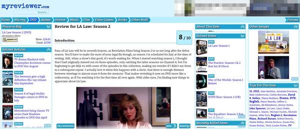
The look remains quite consistent, the extra space is just used to show more of the column contents.
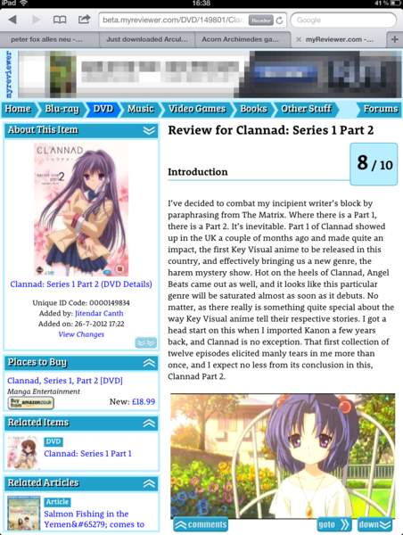
Now for something more narrow, from an iPad in landscape mode:
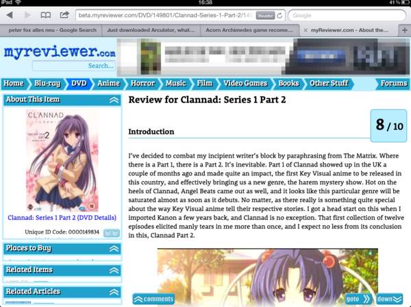
The server side reduces the amount of blind areas for such a small device, to make things easier. Client side code remains the same regardless.
Lastly, portrait mode, now here a bit of CSS is abused to hide the search option and rotate the logo.